
Frankensidebar code for ANY Squarespace template
Hello there! Despite the fact that it’s a Russian DIY and interior design blog, I felt I needed to share something other than home improvement tips. What I’m sharing today is a bit of code that lets you have:
A sidebar which can be used
with any Squarespace template
on all pages or only on selected ones
and can be updated from one place and for all other blog posts
No need to create summaries as a blog landing page
Sounds like a real thing?
I call it Frankensidebar because I used different pieces of code that may have served different purposes from the Squarespace forum and I’m no coder. Surprisingly enough it works)) This blog is made with Brine but that doesn’t really matter which template you’re using.
Since 2016 I’ve been searching for a way to have a sidebar that would allow full control of editing and instant update for all blog posts but I haven’t found any single tutorial to create a sidebar like this for regular Squarespace users who cannot code. You need to have basic HTML skill though. Or consult this website for tips.
Step 01
Create a new blog post or choose an existing one as a Source
This one blog post that you’ll choose will be the Source. It will contain your actual sidebar that you’ll create in a Code Block. All other posts will be Recipients.
You can either create a new blog post within the same blog collection or edit an existing one as a Source. The Source post needs to be published in order for the sidebar to load into the Recipients.
Every time you need to update your sidebar you just go to the Source blog post, save the changes and it automatically updates in all other Recipient posts.
Step 02
Create & style your sidebar in a Source blog post
The sidebar itself is a Code Block filled with HTML and styled how you want it with CSS. Sorry, no drag-n-drop here((
Add a Code Block and drag it to the desired location, adjust the width of the block as usual. As you see on this page, I have two independent sidebars on either side. You can have as many as you want.

Now it’s time to add some code.
In this Code Block you need to create a div with a unique id. Make sure you give it some complicated name that won’t interfere with native Squarespace elements. Something like “my-mockup-sidebar-left”.
I have several div’s in one Source-sidebar, each with a different number. But that’s optional. This way I can control which div’s are shown on mobile and which are not. I can display them separately or repeat in any other part of the page. You can also have ad containers scattered in the text.
Use HTML code to fill this div’s with the stuff you want. For basic things like adding images, paragraphs, links and styles go here.
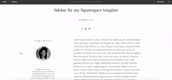
Here’s the code that contains a profile picture, some welcome text, a list of categories and links to social media accounts:
<!-- contains profile pic and some text-->
<div id="my-mockup-sidebar-1">
  <a href="/about-me"><img src="https://link-to-profile-photo.jpg"></a>
  <p style="font-size:14px;line-height:1.3em;">Your text</p>
</div>

<!-- contains an image and the list of categories -->
<div id="my-mockup-sidebar-2">
  <img src="https://link-to-image-category-title.png">
  <p style="color:grey;font-size:14px;" align="center">
  <a href="/blog?category=Puppies">Photos of Cute Puppies</a><br>
  <a href="/blog?category=Kittens">Photos of Cute Kittens</a><br>
  <a href="/blog?category=Raccoons">Funny Raccoons</a><br><br>
  </p>
</div>

<!-- contains social media links -->
<div id="my-mockup-sidebar-3">
  <center><img src="https://social-media-title.png"></center><br>
  <center><a href="https://socialmedia.com/afterworkdiy" target="_blank"><img src="https://social-media-logo-1.png"></a></center>
  <center><a href="https://socialmedia.com/AfterworkDIY/" target="_blank"><img src="https://social-media-logo-2.png"></a></center>
</div>
Fill your Source Code Block:

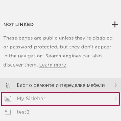
Image storage
I know people use Custom Files in the custom CSS section to store images they use throughout the site. But I personally find it easier to use a disabled Gallery Page in an unlinked section. This way I can use images with tags in summaries or access them with a direct link.
For my Frankensidebars I copy img source links from there.
If you’re happy with the way your sidebar looks, save and publish your blog post.
Copy and store the URL of the Source blog post. We will use it later.
https://yourwebsite.com/blog/source-post
And here is the result:
Step 03
Create a dropzone in Recipient posts
Ok, our sidebar is ready, the Source blog post is ready and published. Then goes the boring part…
We will be going through all other posts and adding another Code Block with an empty div that will serve as a Recipient. Just make sure this div has a unique name of its own (but the same for all recipient posts).
I named mine “mockup-sidebar-container“.

Here’s the code for the Recipients:
<!--code for the dropzone-->
<div id="mockup-sidebar-container"></div>
Hit Save and proceed to the next step.
Step 04
Link the Source with Recipient
Now we will link the empty “mockup-sidebar-container“ in Recipient posts from step 3 with the sidebar we created in the Source blog post in step 2 by adding various scenarios of what should be loaded, where and when.
Go to Settings - Advanced - Code Injection - Footer and insert the code below.
<script>
  $(document).ready(function() {
    if ($(window).width() > 640) {
      $('#mockup-sidebar-container').load('blog/source-post #my-mockup-sidebar-1, #my-mockup-sidebar-2, #my-mockup-sidebar-3');
    }
    else {
      $('#mockup-sidebar-container').load('blog/source-post #my-mockup-sidebar-2');
    }
  });
</script>
Here’s what the code does:
If you open the page on a device with a screen width more than 640 px, the Recipient container will be filled with all three div’s that I have in my Source Code Block. It is my profile pic (#my-mockup-sidebar-1), blog categories (#my-mockup-sidebar-2) and links to my social media (#my-mockup-sidebar-3).
But on mobile with stacked layout I prefer not to take too much screen space and want to show only blog categories (#my-mockup-sidebar-2). This way my readers don’t have to scroll all the way through the long sidebar.
See the difference:
Desktop

Mobile

That’s it 🤍🤍🤍 I hope it helps! Let me know in the comments how to make this code better and more efficient!
Challenge
I hope that someone pro with coding could write and share the code combining this idea with the way I added additional navigation at the bottom of my site. Going through all existing pages and editing them can be a nightmare. As a non-coder it will take me ages to play with the code. And you could be our life saviour!


Обсудим?
Вы можете оставить комментарий как гость или использовать учетную запись в Facebook, Google или Twitter